Working on a suite of applications for a big enterprise, one understands the benefits of reusable components quite quickly. Chances are, at least 50% of functionality, like a user-friendly customer lookup, will be used in the majority of your applications with just a little bit variation in its functionality. Your users expect that this widget will be in a familiar place in every app, will look roughly the same and will act exacly the same. As an experienced DEV, you take a base component library and build your CustomerSelectorCmp on top of it up to the current requirements. It has all the necessary logic, it is used in 20 apps and it works great. Until new requirements come:
- A new app is being commissioned, and CustomerSelectorCmp needs to have a horizontal mode for it; This will probably be used only in this 1 app;
- Our managers have doubled sales numbers by grabbing tablets for client visits and having our app ready to go in the heat of the moment; But CustomerSelectorCmp could be much better with touch;
- We have 10% of managers with special visual needs – it would be very nice to have accessibility mode for CustomerSelectorCmp;
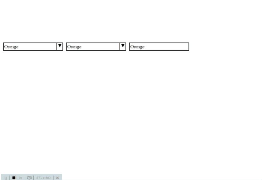
5 years ago, trying to accommodate all this functionality in a single component would inevitably have to violate Single Responsibility Principle and lead to an unmaintainable monstrosity, where key CSS properties are overridden at-least 3 times each, classes are added just to increase CSS selector specificity and !important is your best and worst friend. Well, lucky we are in 2020! Thanks to CSS-Grid and React, we can have a base component that contains all the key functionality and can change appearance drastically with just a dozen lines of CSS and JS. See the following 3 dropdowns? They are the same component! The difference is in 6-8 lines of CSS!
Grab the showcase project form github github and lets dive in.
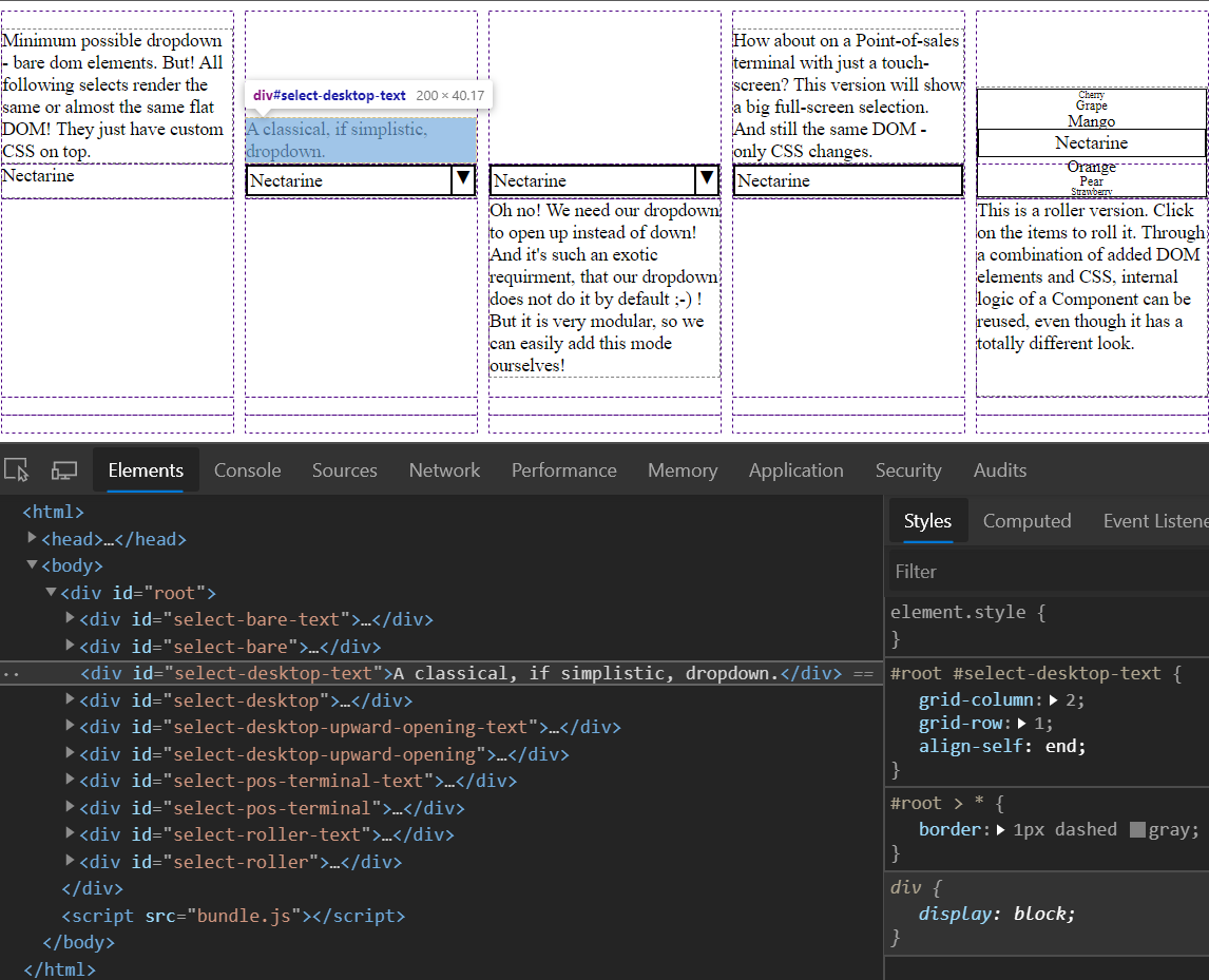
In the sample project, we will see, how the same DOM can be made to have drastically different visuals. For starters, lets look at the Index.tsx . Notice, that it is using React fragments via “<>… </>” and essentially returns a flat list of DOM elements. You are probably used to relegating visual aspects of your apps to CSS and using HTML for content, semantics and structure. But we have found, that having visual structure correspond to DOM tree in HTML is too rigid – all limitation with no advantages. Our React components end up much simpler and yet more flexible, when we restrain them to simply deciding if a given DOM node should be present or not, but not caring about its positioning. For that we use CSS grid. The accompanying Intex.less positions every example Select and it’s accompanying text. We've had flat lists of over 30 components positioned this way – and haven’t looked back once (even with IE11 support :-) ).
BTW, if you haven't read CSS-Tricks Complete Guide to Grid - you need to do it now. This guide has been indespensible in our daily work.
Now lets look at SelectBare.tsx This is the components, which defines the core properties for all our Selects and also renders our core Dom elements. Once again, you see a flat, simplistic DOM. But notice one more thing: our component is not concerned with its own container, label or id. In general – it tries to avoid responsibility as much as possible.
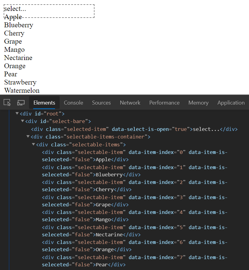
This is not because we want to keep example short, but because we keep responsibility single as much as possible. Does it make difference if we define ‘id’ on the container element instead of the component itself? Generally – no.
As for labels, between visual aspect and content aspects like tooltips, labels have enough requirements to warrant being their own component with their own positioning in the grid. Think about all the properties that may be required for label configuration – do we want to pile them into an already complicated component? And what about the fact, that every reusable component, DatePicker, Search, NumericInput etc... will likely have a label visually attached to it and requiring all the same configuration. Do we want to duplicate this code everywhere? No. In my expereience, we’ve achieved best results when treating Labels as their own independent component.
The general approach here is “less is more”. Whenever you are tempted to add a new property to your component – there has to be a very good justification for it. If we can split a components responsibility into its own independent compnent - we should do it.
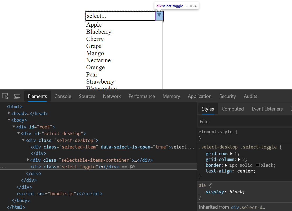
Now, how do we get something that we can actually put into our app? Lets take a look at Select.tsx and Select.less . First – notice that Select reuses the properties interface of SelectBare. This will apply to all the Select's' we will be looking at. Select provides a container for SelectBare to make applying CSS styles and placing it easier.
Now look at `renderAdditionalNodes` property. This is an extension point for SelectBare. It’s main purpose is to receive internal state from SelectBare and render elements that will have access to that state, in this case – a toggle button. Notice an interesting thing – the toggle element is on the same level as core Dom elements of our SelectBare. Outside of inspecting React debug tools, we would be hard pressed to tell, that this are actually two separate components. Our Virutal Dom is ending up very simple – it is good.
I’ll leave the following three Select variants for you to explore, their goal is to show how flexible CSS scaffolding can be. SelectRoller.tsx also shows how we can use extension point of `renderAdditionalNodes` to change the visual structure of the component beyond even what is possible with just CSS.
Summary
Between techniques described here and other modern CSS capabilities like “flex-box”, “calc”, “queries” etc… separating visual structure of our app from the DOM structure is now very easy. With this comes the separation of concerns which lets us make modular compostable components that will be flexible and simple enough to serve us for the next decade.