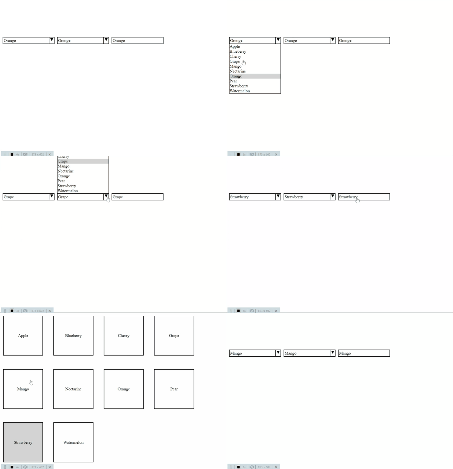
Working on a suite of applications for a big enterprise, one understands the benefits of reusable components quite quickly. Chances are, at least 50% of functionality, like a user-friendly customer lookup, will be used in the majority of your applications with just a little bit variation in its functionality. Your users expect that this widget will be in a familiar place in every app, will look roughly the same and will act exacly the same. As an experienced DEV, you take a base component library and build your CustomerSelectorCmp on top of it up to the current requirements. It has all the necessary logic, it is used in 20 apps and it works great. Until new requirements come:
- A new app is being commissioned, and CustomerSelectorCmp needs to have a horizontal mode for it; This will probably be used only in this 1 app;
- Our managers have doubled sales numbers by grabbing tablets for client visits and having our app ready to go in the heat of the moment; But CustomerSelectorCmp could be much better with touch;
- We have 10% of managers with special visual needs – it would be very nice to have accessibility mode for CustomerSelectorCmp;
5 years ago, trying to accommodate all this functionality in a single component would inevitably have to violate Single Responsibility Principle and lead to an unmaintainable monstrosity, where key CSS properties are overridden at-least 3 times each, classes are added just to increase CSS selector specificity and !important is your best and worst friend. Well, lucky we are in 2020! Thanks to CSS-Grid and React, we can have a base component that contains all the key functionality and can change appearance drastically with just a dozen lines of CSS and JS. See the following 3 dropdowns? They are the same component, rendering the same DOM! The difference is in 6-8 lines of CSS!

Grab the showcase project form github and lets dive in.
